
Recently, I have made some analysis on the volatility of Bitcoin, which is wordy and spontaneous. So I simply share some of my understanding and code as follows. My ability is limited, and the code is not very perfect. If there is any mistake, please point it out and correct it directly.
1. A brief description of the time series of finance
The time series of finance is a set of Stochastic Process series models based on a variable observed in the time dimension. The variable is usually the return rate of assets. Because the return rate is independent of the investment scale and has a statistical nature, it is more valuable to analyze the investment opportunities of the underlying financial assets.
Here, it is boldly assumed that the return rate of Bitcoin conforms to the return rate characteristics of general financial assets, that is, it is a weakly smooth series, which can be demonstrated by consistency testing of several samples.
1-1. Preparations, import libraries, encapsulate functions
The configuration of the research environment is complete. The library required for subsequent calculations is imported here. Since it is written intermittently, it may be redundant. Please clean it up by yourself.
In [1]:
'''
start: 2020-02-01 00:00:00
end: 2020-03-01 00:00:00
period: 1h
exchanges: [{"eid":"Huobi","currency":"BTC_USDT","stocks":0}]
'''
from __future__ import absolute_import, division, print_function
from fmz import * # Import all FMZ functions
import pandas as pd
import numpy as np
import matplotlib.pyplot as plt
import matplotlib.lines as mlines
import seaborn as sns
import statsmodels.api as sm
import statsmodels.formula.api as smf
import statsmodels.tsa.api as smt
from statsmodels.graphics.api import qqplot
from statsmodels.stats.diagnostic import acorr_ljungbox as lb_test
from scipy import stats
from arch import arch_model
from datetime import timedelta
from itertools import product
from math import sqrt
from sklearn.metrics import r2_score, mean_absolute_error, mean_squared_error

task = VCtx(__doc__) # Initialization, verification of FMZ reading of historical data
print(exchange.GetAccount())
Out[1]:
{'Balance': 10000.0, 'FrozenBalance': 0.0, 'Stocks': 0.0, 'FrozenStocks': 0.0}
#### Encapsulate some of the functions, which will be used later. If there is a source, see the note
In [17]:
# Plot functions
def tsplot(y, y_2, lags=None, title='', figsize=(18, 8)):  # source code: https://tomaugspurger.github.io/modern-7-timeseries.html
    fig = plt.figure(figsize=figsize)
    layout = (2, 2)
    ts_ax   = plt.subplot2grid(layout, (0, 0))
    ts2_ax = plt.subplot2grid(layout, (0, 1))
    acf_ax  = plt.subplot2grid(layout, (1, 0))
    pacf_ax = plt.subplot2grid(layout, (1, 1))
    y.plot(ax=ts_ax)
    ts_ax.set_title(title)
    y_2.plot(ax=ts2_ax)
    smt.graphics.plot_acf(y, lags=lags, ax=acf_ax)
    smt.graphics.plot_pacf(y, lags=lags, ax=pacf_ax)
    [ax.set_xlim(0) for ax in [acf_ax, pacf_ax]]
    sns.despine()
    plt.tight_layout()
    return ts_ax, ts2_ax, acf_ax, pacf_ax

# Performance evaluation
def get_rmse(y, y_hat):
    mse = np.mean((y - y_hat)**2)
    return np.sqrt(mse)

def get_mape(y, y_hat):
    perc_err = (100*(y - y_hat))/y
    return np.mean(abs(perc_err))

def get_mase(y, y_hat):
    abs_err = abs(y - y_hat)
    dsum=sum(abs(y[1:] - y_hat[1:]))
    t = len(y)
    denom = (1/(t - 1))* dsum
    return np.mean(abs_err/denom)

def mae(observation, forecast):
    error = mean_absolute_error(observation, forecast)
    print('Mean Absolute Error (MAE): {:.3g}'.format(error))
    return error

def mape(observation, forecast):
    observation, forecast = np.array(observation), np.array(forecast)
    # Might encounter division by zero error when observation is zero
    error = np.mean(np.abs((observation - forecast) / observation)) * 100
    print('Mean Absolute Percentage Error (MAPE): {:.3g}'.format(error))
    return error

def rmse(observation, forecast):
    error = sqrt(mean_squared_error(observation, forecast))
    print('Root Mean Square Error (RMSE): {:.3g}'.format(error))
    return error

def evaluate(pd_dataframe, observation, forecast):
    first_valid_date = pd_dataframe[forecast].first_valid_index()
    mae_error = mae(pd_dataframe[observation].loc[first_valid_date:, ], pd_dataframe[forecast].loc[first_valid_date:, ])
    mape_error = mape(pd_dataframe[observation].loc[first_valid_date:, ], pd_dataframe[forecast].loc[first_valid_date:, ])
    rmse_error = rmse(pd_dataframe[observation].loc[first_valid_date:, ], pd_dataframe[forecast].loc[first_valid_date:, ])

    ax = pd_dataframe.loc[:, [observation, forecast]].plot(figsize=(18,5))
    ax.xaxis.label.set_visible(False)
    return
1-2. Let's start with a brief understanding of Bitcoin's historical data
From a statistical point of view, we can take a look at some data characteristics of Bitcoin. Taking the data description of the past year as an example, the return rate is calculated in a simple way, that is, the closing price is logarithmically subtracted. The formula is as follows:
In [3]:
df = get_bars('huobi.btc_usdt', '1d', count=10000, start='2019-01-01')
btc_year = pd.DataFrame(df['close'],dtype=np.float)
btc_year.index.name = 'date'
btc_year.index = pd.to_datetime(btc_year.index)
btc_year['log_price'] = np.log(btc_year['close'])
btc_year['log_return'] = btc_year['log_price'] - btc_year['log_price'].shift(1)
btc_year['log_return_100x'] = np.multiply(btc_year['log_return'], 100)

btc_year_test = pd.DataFrame(btc_year['log_return'].dropna(), dtype=np.float)
btc_year_test.index.name = 'date'
mean = btc_year_test.mean()
std = btc_year_test.std()
normal_result = pd.DataFrame(index=['Mean Value', 'Std Value', 'Skewness Value','Kurtosis Value'], columns=['model value'])
normal_result['model value']['Mean Value'] = ('%.4f'% mean[0])
normal_result['model value']['Std Value'] = ('%.4f'% std[0])
normal_result['model value']['Skewness Value'] = ('%.4f'% btc_year_test.skew())
normal_result['model value']['Kurtosis Value'] = ('%.4f'% btc_year_test.kurt())
normal_result
Out[3]:
The feature of thick fat tails is that the shorter the time scale is, the more significant the feature is. The kurtosis will increase with the increase of data frequency, and the feature will be very obvious in high-frequency data.
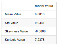
Taking the daily closing price data from January 1, 2019 to the present as an example, we makes a descriptive analysis of its logarithmic return rate, and it can be seen that the simple return rate series of Bitcoin does not conform to the normal distribution, and it has the obvious characteristic of thick fat tails.
The mean value of the sequence is 0.0016, the standard deviation is 0.0341, the skewness is -0.6819, and the kurtosis is 7.2243, which is much higher than the normal distribution and has the characteristic of thick fat tails. The normality of Bitcoin's simple return rate is measured and tested with QQ chart, as follows:
In [4]:
fig = plt.figure(figsize=(4,4))
ax = fig.add_subplot(111)
fig = qqplot(btc_year_test['log_return'], line='q', ax=ax, fit=True)
Out[4]:
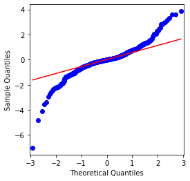
It can be seen that the QQ chart is perfect, and the logarithmic return series for Bitcoin does not conform to a normal distribution from the results, and it has obvious characteristic of thick fat tails.
Next, let's take a look at the volatility aggregation effect, that is, financial time series are often accompanied by greater volatility after larger volatility, while smaller volatility is usually followed by smaller volatility.
Volatility Clustering reflects the positive and negative feedback effects of volatility and it is highly correlated with fat tails characteristics. Econometrically, this implies that the time series of volatility may be autocorrelated, i.e., the volatility of the current period may have some relationship with the previous period, the second previous period, or even the third previous period.
In [5]:
df = get_bars('huobi.btc_usdt', '1d', count=50000, start='2006-01-01')
btc_year = pd.DataFrame(df['close'],dtype=np.float)
btc_year.index.name = 'date'
btc_year.index = pd.to_datetime(btc_year.index)
btc_year['log_price'] = np.log(btc_year['close'])
btc_year['log_return'] = btc_year['log_price'] - btc_year['log_price'].shift(1)
btc_year['log_return_100x'] = np.multiply(btc_year['log_return'], 100)

btc_year_test = pd.DataFrame(btc_year['log_return'].dropna(), dtype=np.float)
btc_year_test.index.name = 'date'
sns.mpl.rcParams['figure.figsize'] = (18, 4)  # Volatility
ax1 = btc_year_test['log_return'].plot()
ax1.xaxis.label.set_visible(False)
Out[5]:
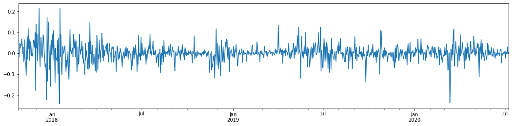
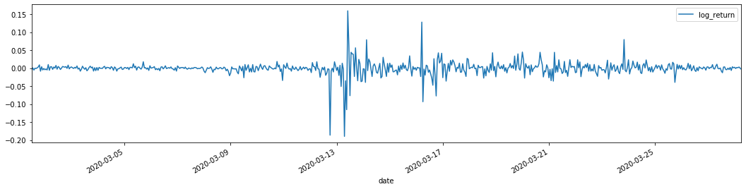
Taking the daily logarithmic rate of return of Bitcoin in the last 3 years and plotting it out, the phenomenon of volatility clustering can be clearly seen. After the bull market in Bitcoin in 2018, it was in a stable stance for most of the time. As we can see on the far right, in March 2020, as global financial markets tumbled, there was also a run on Bitcoin liquidity, with yields plummeting by nearly 40% in a day, with sharp negative swings.
In a word, from the intuitive observation, we can see that a large fluctuation will be followed by a dense fluctuation with a large probability, which is also the aggregation effect of volatility. If this volatility range is predictable, it is valuable for BTC's short-term transactions, which is also the purpose of discussing volatility.
1-3. Data preparation
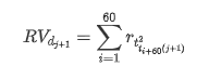
To prepare the training sample set, first, we establish a benchmark sample, in which the logarithmic return rate is the equivalent observed volatility. Because the volatility of the day cannot be observed directly, hourly data is used for resampling to infer the realized volatility of the day and take it as the dependent variable of the volatility.
The resampling method is based on hourly data. The formula is shown as follows:
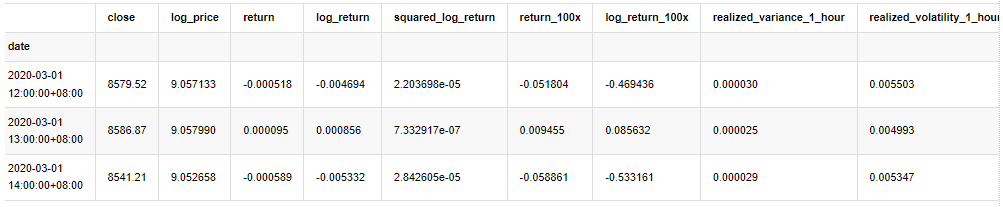
In [4]:
count_num = 100000
start_date = '2020-03-01'
df = get_bars('huobi.btc_usdt', '1m', count=50000, start='2020-02-13') # Take the minute data
kline_1m = pd.DataFrame(df['close'], dtype=np.float)
kline_1m.index.name = 'date'
kline_1m['log_price'] = np.log(kline_1m['close'])
kline_1m['return'] = kline_1m['close'].pct_change().dropna()
kline_1m['log_return'] = kline_1m['log_price'] - kline_1m['log_price'].shift(1)
kline_1m['squared_log_return'] = np.power(kline_1m['log_return'], 2)
kline_1m['return_100x'] = np.multiply(kline_1m['return'], 100)
kline_1m['log_return_100x'] = np.multiply(kline_1m['log_return'], 100) # Enlarge 100 times
df = get_bars('huobi.btc_usdt', '1h', count=860, start='2020-02-13') # Take the hour data
kline_all = pd.DataFrame(df['close'], dtype=np.float)
kline_all.index.name = 'date'
kline_all['log_price'] = np.log(kline_all['close']) # Calculate daily logarithmic rate of return
kline_all['return'] = kline_all['log_price'].pct_change().dropna()
kline_all['log_return'] = kline_all['log_price'] - kline_all['log_price'].shift(1) # Calculate logarithmic rate of return
kline_all['squared_log_return'] = np.power(kline_all['log_return'], 2) # The exponential square of logarithmic daily rate of return
kline_all['return_100x'] = np.multiply(kline_all['return'], 100)
kline_all['log_return_100x'] = np.multiply(kline_all['log_return'], 100) # Enlarge 100 times
kline_all['realized_variance_1_hour'] = kline_1m.loc[:, 'squared_log_return'].resample('h', closed='left', label='left').sum().copy() # Resampling to days
kline_all['realized_volatility_1_hour'] = np.sqrt(kline_all['realized_variance_1_hour']) # Volatility of variance derivation
kline_all = kline_all[4:-29] # Remove the last line because it is missing
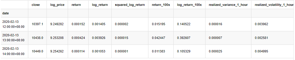
kline_all.head(3)
Out[4]:
Prepare the data outside the sample in the same way
In [5]:
# Prepare the data outside the sample with realized daily volatility
df = get_bars('huobi.btc_usdt', '1m', count=50000, start='2020-02-13')  # Take the minute data
kline_1m = pd.DataFrame(df['close'], dtype=np.float)
kline_1m.index.name = 'date'
kline_1m['log_price'] = np.log(kline_1m['close'])
kline_1m['log_return'] = kline_1m['log_price'] - kline_1m['log_price'].shift(1)
kline_1m['log_return_100x'] = np.multiply(kline_1m['log_return'], 100)  # Enlarge 100 times
kline_1m['squared_log_return'] = np.power(kline_1m['log_return_100x'], 2)
kline_1m#.tail()
df = get_bars('huobi.btc_usdt', '1h', count=860, start='2020-02-13')  # Take the hour data
kline_test = pd.DataFrame(df['close'], dtype=np.float)
kline_test.index.name = 'date'
kline_test['log_price'] = np.log(kline_test['close'])  # Calculate daily logarithmic rate of return
kline_test['log_return'] = kline_test['log_price'] - kline_test['log_price'].shift(1)  # Calculate logarithmic rate of return
kline_test['log_return_100x'] = np.multiply(kline_test['log_return'], 100)  # Enlarge 100 times
kline_test['squared_log_return'] = np.power(kline_test['log_return_100x'], 2)  # The exponential square of logarithmic daily rate of return
kline_test['realized_variance_1_hour'] = kline_1m.loc[:, 'squared_log_return'].resample('h', closed='left', label='left').sum()  # Resampling to days
kline_test['realized_volatility_1_hour'] = np.sqrt(kline_test['realized_variance_1_hour'])  # Volatility of variance derivation
kline_test = kline_test[4:-2]
In order to understand the basic data of the sample, a simple descriptive analysis is made as follows:
In [9]:
line_test = pd.DataFrame(kline_train['log_return'].dropna(), dtype=np.float)
line_test.index.name = 'date'

mean = line_test.mean()  # Calculate mean value and standard deviation
std = line_test.std()

line_test.sort_values(by = 'log_return', inplace = True)  # Resort
s_r = line_test.reset_index(drop = False)  # After resorting, update index
s_r['p'] = (s_r.index - 0.5) / len(s_r)  # Calculate the percentile p(i)
s_r['q'] = (s_r['log_return'] - mean) / std  # Calculate the value of q

st = line_test.describe()
x1 ,y1 = 0.25, st['log_return']['25%']
x2 ,y2 = 0.75, st['log_return']['75%']

fig = plt.figure(figsize = (18,8))
layout = (2, 2)
ax1 = plt.subplot2grid(layout, (0, 0), colspan=2)# Plot the data distribution
ax2 = plt.subplot2grid(layout, (1, 0))# Plot histogram
ax3 = plt.subplot2grid(layout, (1, 1))# Draw the QQ chart, the straight line is the connection of the quarter digit, three-quarters digit, which is basically conforms to the normal distribution

ax1.scatter(line_test.index, line_test.values)
line_test.hist(bins=30,alpha = 0.5,ax = ax2)
line_test.plot(kind = 'kde', secondary_y=True,ax = ax2)
ax3.plot(s_r['p'],s_r['log_return'],'k.',alpha = 0.1)
ax3.plot([x1,x2],[y1,y2],'-r')
sns.despine()
plt.tight_layout()
Out[9]:
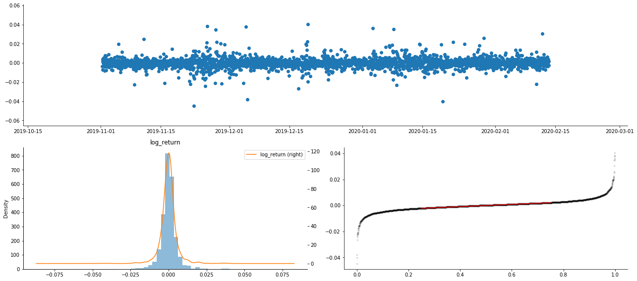
As a result, there is obvious volatility aggregation and leverage effect in the time series chart of logarithmic returns.
The skewness in the distribution chart of logarithmic returns is less than 0, indicating that the returns in the sample are slightly negative and biased to the right. In the QQ chart of logarithmic returns, we can see that the distribution of logarithmic returns is not normal.
The skewness of the data distribution is less than 1, indicating that the returns within the sample are slightly positive and slightly right biased. The kurtosis value is greater than 3, indicating that the yield is thick fat tails distributed.
Now that we have reached this point, let's do another statistical test.
In [7]:
line_test = pd.DataFrame(kline_all['log_return'].dropna(), dtype=np.float)
line_test.index.name = 'date'
mean = line_test.mean()
std = line_test.std()
normal_result = pd.DataFrame(index=['Mean Value', 'Std Value', 'Skewness Value','Kurtosis Value',
                                    'Ks Test Value','Ks Test P-value',
                                    'Jarque Bera Test','Jarque Bera Test P-value'],
                    columns=['model value'])
normal_result['model value']['Mean Value'] = ('%.4f'% mean[0])
normal_result['model value']['Std Value'] = ('%.4f'% std[0])
normal_result['model value']['Skewness Value'] = ('%.4f'% line_test.skew())
normal_result['model value']['Kurtosis Value'] = ('%.4f'% line_test.kurt())
normal_result['model value']['Ks Test Value'] = stats.kstest(line_test, 'norm', (mean, std))[0]
normal_result['model value']['Ks Test P-value'] = stats.kstest(line_test, 'norm', (mean, std))[1]
normal_result['model value']['Jarque Bera Test'] = stats.jarque_bera(line_test)[0]
normal_result['model value']['Jarque Bera Test P-value'] = stats.jarque_bera(line_test)[1]
normal_result
Out[7]:
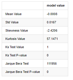
Kolmogorov - Smirnov and Jarque - Bera test statistics are used respectively. The original hypothesis is characterized by significant difference and normal distribution. If the P value is less than the critical value of 0.05% confidence level, the original hypothesis is rejected.
It can be seen that the kurtosis value is greater than 3, showing the characteristics of thick fat tails. The P values of KS and JB are less than the confidence interval. The assumption of normal distribution is rejected, which proves that the return rate of BTC does not have the characteristics of normal distribution, and the empirical study has the characteristics of thick fat tails.
1-4. Comparison of realized volatility and observed volatility
We combine squared_ log_ return (logarithmic yield squared) and realized_variance (realized variance) for observations.
In [11]:
fig, ax = plt.subplots(figsize=(18, 6))
start = '2020-03-08 00:00:00+08:00'
end = '2020-03-20 00:00:00+08:00'

np.abs(kline_all['squared_log_return']).loc[start:end].plot(ax=ax,label='squared log return')
kline_all['realized_variance_1_hour'].loc[start:end].plot(ax=ax,label='realized variance')
plt.legend(loc='best')
Out[11]:
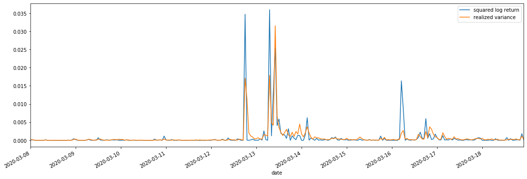
It can be seen that when the realized variance range is larger, the volatility of return rate range is also larger, and the realized return rate is smoother. Both of them are easy to observe obvious aggregation effects.
From a purely theoretical point of view, RV is closer to the real volatility, while short-term volatility is smoothed out due to intraday volatility belongs to overnight data, so from an observational point of view, intraday volatility is more suitable for a lower frequency of volatility stock market. High frequency trading and 7*24 hour market characteristics of BTC make it more suitable to use RV to determine as the benchmark volatility.
2. Smoothness of the time series
If it is a non-stationary series, it needs to be adjusted approximately to a stationary series. The common way is to do difference processing. Theoretically, after many times of difference, the non-stationary series can be approximated to a stationary series. If the covariance of the sample series is stable, the expectation, variance and covariance of its observations will not change with time, indicating that the sample series is more convenient for inference in statistical analysis.
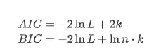
The unit root test, namely ADF test, is used here. ADF test uses t test to observe significance. In principle, if the series does not show obvious trend, only constant items are retained. If the series has trend, the regression equation should include both constant items and time trend items. In addition, AIC and BIC criteria can be used for evaluation based on information criteria. If formula is required, it is as follows:
In [8]:
stable_test = kline_all['log_return']
adftest = sm.tsa.stattools.adfuller(np.array(stable_test), autolag='AIC')
adftest2 = sm.tsa.stattools.adfuller(np.array(stable_test), autolag='BIC')
output=pd.DataFrame(index=['ADF Statistic Test Value', "ADF P-value", "Lags", "Number of Observations",
                           "Critical Value(1%)","Critical Value(5%)","Critical Value(10%)"],
                    columns=['AIC','BIC'])
output['AIC']['ADF Statistic Test Value'] = adftest[0]
output['AIC']['ADF P-value'] = adftest[1]
output['AIC']['Lags'] = adftest[2]
output['AIC']['Number of Observations'] = adftest[3]
output['AIC']['Critical Value(1%)'] = adftest[4]['1%']
output['AIC']['Critical Value(5%)'] = adftest[4]['5%']
output['AIC']['Critical Value(10%)'] = adftest[4]['10%']
output['BIC']['ADF Statistic Test Value'] = adftest2[0]
output['BIC']['ADF P-value'] = adftest2[1]
output['BIC']['Lags'] = adftest2[2]
output['BIC']['Number of Observations'] = adftest2[3]
output['BIC']['Critical Value(1%)'] = adftest2[4]['1%']
output['BIC']['Critical Value(5%)'] = adftest2[4]['5%']
output['BIC']['Critical Value(10%)'] = adftest2[4]['10%']
output
Out[8]:
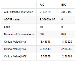
The original assumption is that there is no unit root in the series, that is, the alternative assumption is that the series is stationary. Test P value is far less than 0.05% confidence level cut-off value, reject the original assumption, so the log rate of return is a stationary series, can be modeled by using statistical time series model.
3. Model identification and order determination
In order to establish the mean value equation, it is necessary to do an autocorrelation test on the sequence to ensure that the error term does not have autocorrelation. First, try to plot autocorrelation ACF and partial correlation PACF as follows:
In [19]:
tsplot(kline_all['log_return'], kline_all['log_return'], title='Log Return', lags=100)
Out[19]:
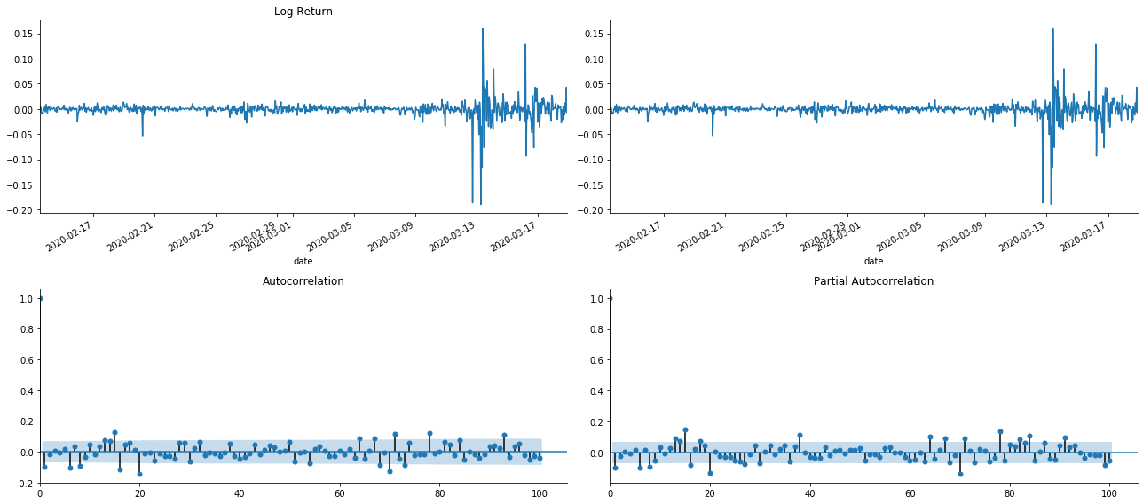
It can be seen that the effect of truncation is perfect. At that moment, this picture gave me an inspiration. Is the market really invalid? In order to verify, we will do autocorrelation analysis on the return series and determine the lag order of the model.
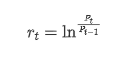
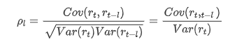
The commonly used correlation coefficient is to measure the correlation between it and itself, that is, the correlation between r(t) and r (t-l) at a certain time in the past:
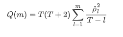
Then let's do a quantitative test. The original assumption is that all autocorrelation coefficients are 0, that is, there is no autocorrelation in the series. The test statistics formula is written as follows:
Ten autocorrelation coefficients were taken for analysis, as follows:
In [9]:
acf,q,p = sm.tsa.acf(kline_all['log_return'], nlags=15,unbiased=True,qstat = True, fft=False)  # Test 10 autocorrelation coefficients
output = pd.DataFrame(np.c_[range(1,16), acf[1:], q, p], columns=['lag', 'ACF', 'Q', 'P-value'])
output = output.set_index('lag')
output
Out[9]:
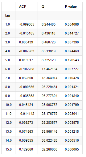
According to the test statistic Q and P-value, we can see that the autocorrelation function ACF gradually becomes 0 after order 0. The P-values of Q test statistics are small enough to reject the original assumption, so there is autocorrelation in the series.
4. ARMA modeling
The AR and MA models are quite simple. To put it simply, Markdown is too tired to write formulas. If you are interested, please check them yourself. AR (Autoregression) model is mainly used to model time series. If the series has passed the ACF test, that is, the autocorrelation coefficient with an interval of 1 is significant, that is, the data at time may be useful for predicting time t.
MA (Moving Average) model uses the random interference or error prediction of the past q periods to express the current prediction value linearly.
In order to fully describe the dynamic structure of the data, it is necessary to increase the order of AR or MA models, but such parameters will make the calculation more complex. Therefore, in order to simplify this process, an autoregressive moving average (ARMA) model is proposed.
Since price time series are generally non-stationary, and the optimization effect of difference method on stationarity has been discussed previously, ARIMA (p, d, q) (sum autoregressive moving average) model adds d-order difference processing on the basis of the application of existing models to series. However, since we have used logarithms, we can use ARMA (p, q) directly.
In a word, the only difference between ARIMA model and ARMA model building process is that if the unstable results are obtained after analyzing the stationarity, the model will make a quadratic difference to the series directly and then perform the stationarity test, and then determine the order p and q until the series is stable. After building the model and evaluating it, the subsequent prediction will be made, eliminating the step of going back to do the difference. However, the second-order difference of price is meaningless, so ARMA is the best choice.
4-1. Order selection
Next, we can select the order directly by the information criterion, here we try it with the thermodynamic diagrams of AIC and BIC.
In [10]:
def select_best_params():
    ps = range(0, 4)
    ds= range(1, 2)
    qs = range(0, 4)
    parameters = product(ps, ds, qs)
    parameters_list = list(parameters)

    p_min = 0
    d_min = 0
    q_min = 0
    p_max = 3
    d_max = 3
    q_max = 3

    results_aic = pd.DataFrame(index=['AR{}'.format(i) for i in range(p_min,p_max+1)],
                               columns=['MA{}'.format(i) for i in range(q_min,q_max+1)])
    results_bic = pd.DataFrame(index=['AR{}'.format(i) for i in range(p_min,p_max+1)],
                               columns=['MA{}'.format(i) for i in range(q_min,q_max+1)])

    best_params = []
    aic_results = []
    bic_results = []
    hqic_results = []
    best_aic = float("inf")
    best_bic = float("inf")
    best_hqic = float("inf")
    warnings.filterwarnings('ignore')
    for param in parameters_list:
        try:
            model = sm.tsa.SARIMAX(kline_all['log_price'], order=(param[0], param[1], param[2])).fit(disp=-1)
            results_aic.loc['AR{}'.format(param[0]), 'MA{}'.format(param[2])] = model.aic
            results_bic.loc['AR{}'.format(param[0]), 'MA{}'.format(param[2])] = model.bic
        except ValueError:
            continue

        aic_results.append([param, model.aic])
        bic_results.append([param, model.bic])
        hqic_results.append([param, model.hqic])

    results_aic = results_aic[results_aic.columns].astype(float)
    results_bic = results_bic[results_bic.columns].astype(float)

    # Draw thermodynamic diagrams of AIC and BIC to find the best
    fig = plt.figure(figsize=(18, 9))
    layout = (2, 2)
    aic_ax = plt.subplot2grid(layout, (0, 0))
    bic_ax = plt.subplot2grid(layout, (0, 1))

    aic_ax = sns.heatmap(results_aic,mask=results_aic.isnull(),ax=aic_ax,cmap='OrRd',annot=True,fmt='.2f',);
    aic_ax.set_title('AIC');
    bic_ax = sns.heatmap(results_bic,mask=results_bic.isnull(),ax=bic_ax,cmap='OrRd',annot=True,fmt='.2f',);
    bic_ax.set_title('BIC');

    aic_df = pd.DataFrame(aic_results)
    aic_df.columns = ['params', 'aic']
    best_params.append(aic_df.params[aic_df.aic.idxmin()])
    print('AIC best param: {}'.format(aic_df.params[aic_df.aic.idxmin()]))

    bic_df = pd.DataFrame(bic_results)
    bic_df.columns = ['params', 'bic']
    best_params.append(bic_df.params[bic_df.bic.idxmin()])
    print('BIC best param: {}'.format(bic_df.params[bic_df.bic.idxmin()]))

    hqic_df = pd.DataFrame(hqic_results)
    hqic_df.columns = ['params', 'hqic']
    best_params.append(hqic_df.params[hqic_df.hqic.idxmin()])
    print('HQIC best param: {}'.format(hqic_df.params[hqic_df.hqic.idxmin()]))

    for best_param in best_params:
        if best_params.count(best_param)>=2:
            print('Best Param Selected: {}'.format(best_param))
            return best_param

best_param = select_best_params()
Out[10]:
AIC best param: (0, 1, 1)
BIC best param: (0, 1, 1)
HQIC best param: (0, 1, 1)
Best Param Selected: (0, 1, 1)
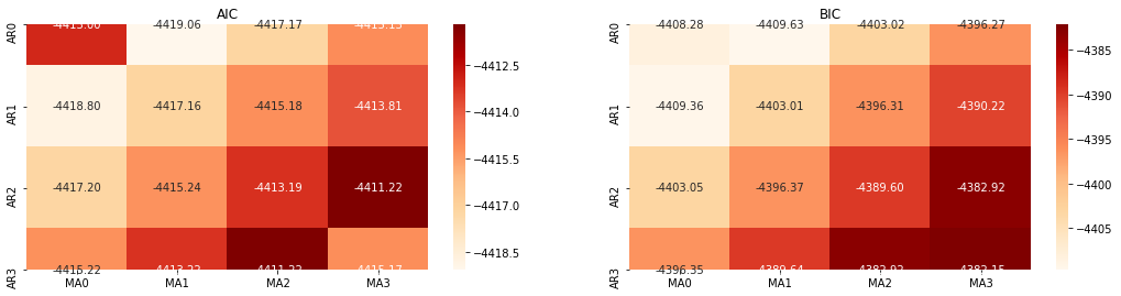
It is obvious that the optimal first-order parameter combination for logarithmic price is (0,1,1), which is simple and straightforward. The log_return (logarithmic rate of return) performs the same operation. The AIC optimal value is (4,3), and the BIC optimal value is (0,1). So the optimal combination of parameters for log_return (logarithmic rate of return) is (0,1).
4-2. ARMA modeling and matching
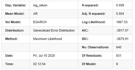
Quarterly coefficients are not required, but SARIMAX is richer in attributes, so it was decided to choose this model for modeling and incidentally draw a descriptive analysis as follows:
In [11]:
params = (0, 0, 1)
training_model = smt.SARIMAX(endog=kline_all['log_return'], trend='c', order=params, seasonal_order=(0, 0, 0, 0))
model_results = training_model.fit(disp=False)
model_results.summary()
Out[11]:
Statespace Model Results
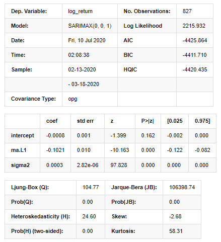
Warnings:
[1] Covariance matrix calculated using the outer product of gradients (complex-step).
In [27]:
model_results.plot_diagnostics(figsize=(18, 10));
Out[27]:
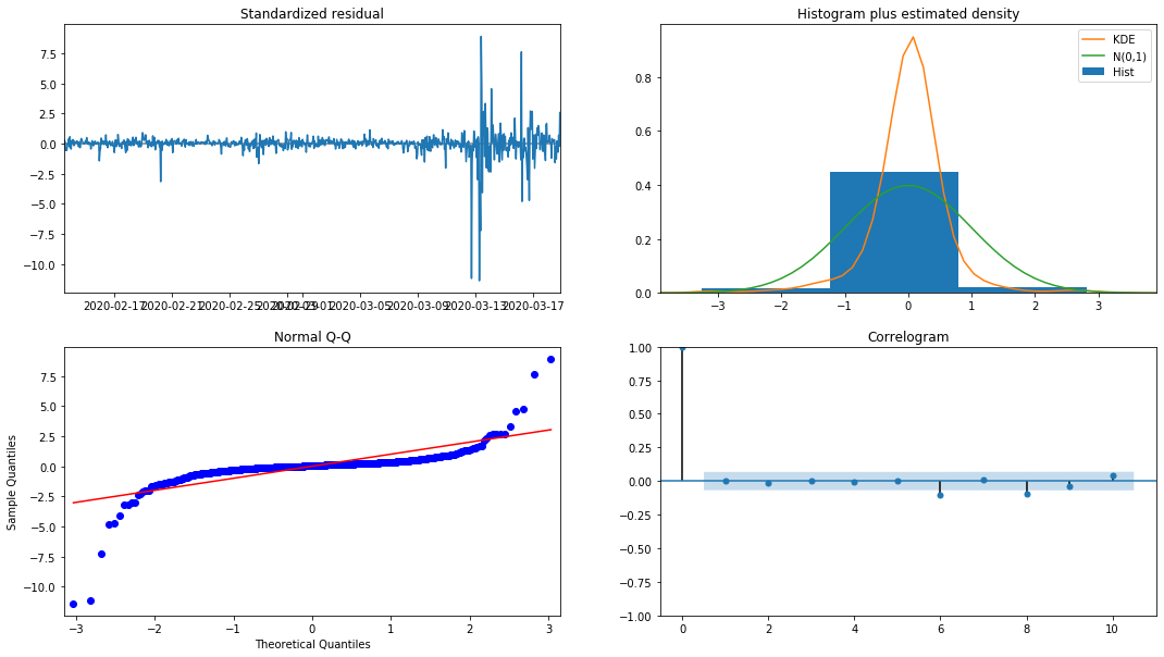
The probability density KDE in the histogram is far from the normal distribution N (0,1), indicating that the residual is not a normal distribution. In the QQ quantile plot, the residuals of the samples sampled from the standard normal distribution do not fully follow the linear trend, so it is confirmed again that the residuals are not normal distribution and are closer to white noise.
Then, having said that, whether the model can be used still needs to be tested.
4-3. Model test
The matching effect of the residual is not ideal, so we performed the Durbin Watson test on it. The original hypothesis of the test is that the sequence does not have autocorrelation, and the alternative hypothesis sequence is stationary. In addition, if the P values of LB, JB and H tests are less than the critical value of 0.05% confidence level, the original hypothesis will be rejected.
In [12]:
het_method='breakvar'
norm_method='jarquebera'
sercor_method='ljungbox'
(het_stat, het_p) = model_results.test_heteroskedasticity(het_method)[0]
norm_stat, norm_p, skew, kurtosis = model_results.test_normality(norm_method)[0]
sercor_stat, sercor_p = model_results.test_serial_correlation(method=sercor_method)[0]
sercor_stat = sercor_stat[-1] # The last value of the maximum period
sercor_p = sercor_p[-1]
dw = sm.stats.stattools.durbin_watson(model_results.filter_results.standardized_forecasts_error[0, model_results.loglikelihood_burn:])
arroots_outside_unit_circle = np.all(np.abs(model_results.arroots) > 1)
maroots_outside_unit_circle = np.all(np.abs(model_results.maroots) > 1)
print('Test heteroskedasticity of residuals ({}): stat={:.3f}, p={:.3f}'.format(het_method, het_stat, het_p));
print('\nTest normality of residuals ({}): stat={:.3f}, p={:.3f}'.format(norm_method, norm_stat, norm_p));
print('\nTest serial correlation of residuals ({}): stat={:.3f}, p={:.3f}'.format(sercor_method, sercor_stat, sercor_p));
print('\nDurbin-Watson test on residuals: d={:.2f}\n\t(NB: 2 means no serial correlation, 0=pos, 4=neg)'.format(dw))
print('\nTest for all AR roots outside unit circle (>1): {}'.format(arroots_outside_unit_circle))
print('\nTest for all MA roots outside unit circle (>1): {}'.format(maroots_outside_unit_circle))
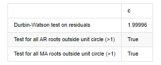
root_test=pd.DataFrame(index=['Durbin-Watson test on residuals','Test for all AR roots outside unit circle (>1)','Test for all MA roots outside unit circle (>1)'],columns=['c'])
root_test['c']['Durbin-Watson test on residuals']=dw
root_test['c']['Test for all AR roots outside unit circle (>1)']=arroots_outside_unit_circle
root_test['c']['Test for all MA roots outside unit circle (>1)']=maroots_outside_unit_circle
root_test
Out[12]:
Test heteroskedasticity of residuals (breakvar): stat=24.598, p=0.000
Test normality of residuals (jarquebera): stat=106398.739, p=0.000
Test serial correlation of residuals (ljungbox): stat=104.767, p=0.000
Durbin-Watson test on residuals: d=2.00
(NB: 2 means no serial correlation, 0=pos, 4=neg)
Test for all AR roots outside unit circle (>1): True
Test for all MA roots outside unit circle (>1): True
In [13]:
kline_all['log_price_dif1'] = kline_all['log_price'].diff(1)
kline_all = kline_all[1:]
kline_train = kline_all

training_label = 'log_return'
training_ts = pd.DataFrame(kline_train[training_label], dtype=np.float)

delta = model_results.fittedvalues - training_ts[training_label]
adjR = 1 - delta.var()/training_ts[training_label].var()
adjR_test=pd.DataFrame(index=['adjR2'],columns=['Value'])
adjR_test['Value']['adjR2']=adjR**2
adjR_test
Out[13]:
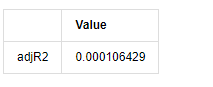
If the Durbin Watson test statistic is equal to 2, confirms that the series has no correlation, and its statistical value is distributed between (0,4). Close to 0 means that the positive correlation is high, while close to 4 means that the negative correlation is high. Here it is approximately equal to 2. The P value of other tests is small enough, the unit characteristic root is outside the unit circle, and the larger the value of the modified adjR², the better it will be. The overall result of the measure does not seem to be satisfactory.
In [14]:
model_results.params
Out[14]:
intercept -0.000817
ma.L1 -0.102102
sigma2 0.000275
dtype: float64
To sum up, this order setting parameter can basically meet the requirements of modeling time series and subsequent volatility modeling, but the matching effect is so-so. The model expression is as follows:
4-4. Model prediction
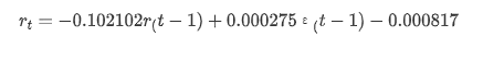
Next, the trained model is matched forward. statsmodels provides static and dynamic options for matching and forecasting. The difference lies in whether the observation value is used in the next step of forecasting, or the prediction value generated in the previous step is used iteratively. The prediction effects of log_return (logarithmic rate of return) are as follows:
In [37]:
start_date = '2020-02-28 12:00:00+08:00'
end_date = start_date

pred_dy = model_results.get_prediction(start=start_date, dynamic=False)
pred_dy_ci = pred_dy.conf_int()

fig, ax = plt.subplots(nrows=1, ncols=1, figsize=(18, 6))
ax.plot(kline_all['log_return'].loc[start_date:], label='Log Return', linestyle='-')
ax.plot(pred_dy.predicted_mean.loc[start_date:], label='Forecast Log Return', linestyle='--')
ax.fill_between(pred_dy_ci.index,pred_dy_ci.iloc[:, 0],pred_dy_ci.iloc[:, 1], color='g', alpha=.25)

plt.ylabel("BTC Log Return")
plt.legend(loc='best')
plt.tight_layout()
sns.despine()
Out[37]:
It can be seen that the fitting effect of the static mode on the sample is excellent, the sample data can be almost covered by 95% confidence interval, and the dynamic mode is a little out of control.
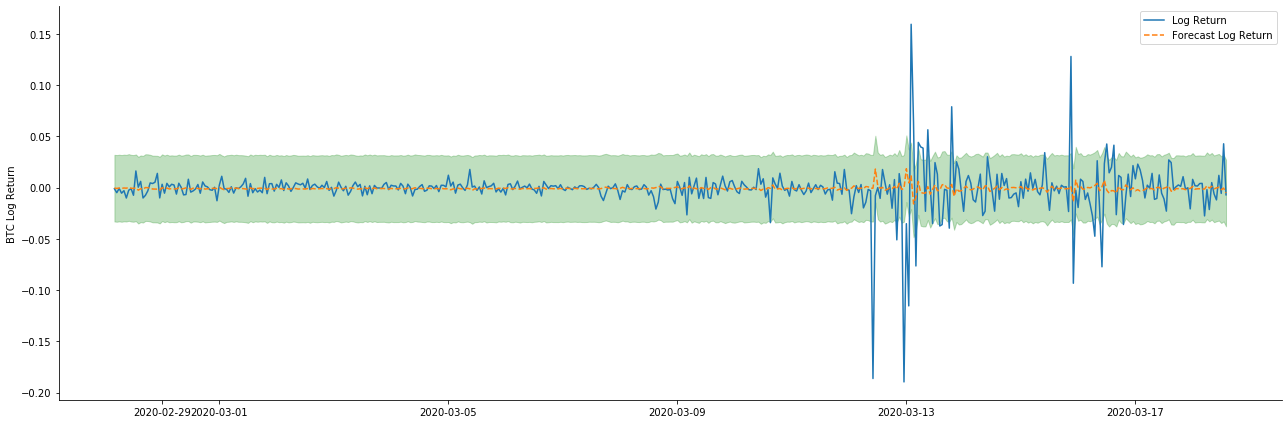
So let's look at the data matching effect in dynamic mode:
In [38]:
start_date = '2020-02-28 12:00:00+08:00'
end_date = start_date

pred_dy = model_results.get_prediction(start=start_date, dynamic=True)
pred_dy_ci = pred_dy.conf_int()

fig, ax = plt.subplots(nrows=1, ncols=1, figsize=(18, 6))
ax.plot(kline_all['log_return'].loc[start_date:], label='Log Return', linestyle='-')
ax.plot(pred_dy.predicted_mean.loc[start_date:], label='Forecast Log Return', linestyle='--')
ax.fill_between(pred_dy_ci.index,pred_dy_ci.iloc[:, 0],pred_dy_ci.iloc[:, 1], color='g', alpha=.25)

plt.ylabel("BTC Log Return")
plt.legend(loc='best')
plt.tight_layout()
sns.despine()
Out[38]:
It can be seen that the fitting effect of the two models on the sample is excellent, and the mean value can be almost covered by the 95% confidence interval, but the static model is obviously more suitable. Next, let's look at the prediction effect of 50 steps out-of-sample, that is, the first 50 hours:
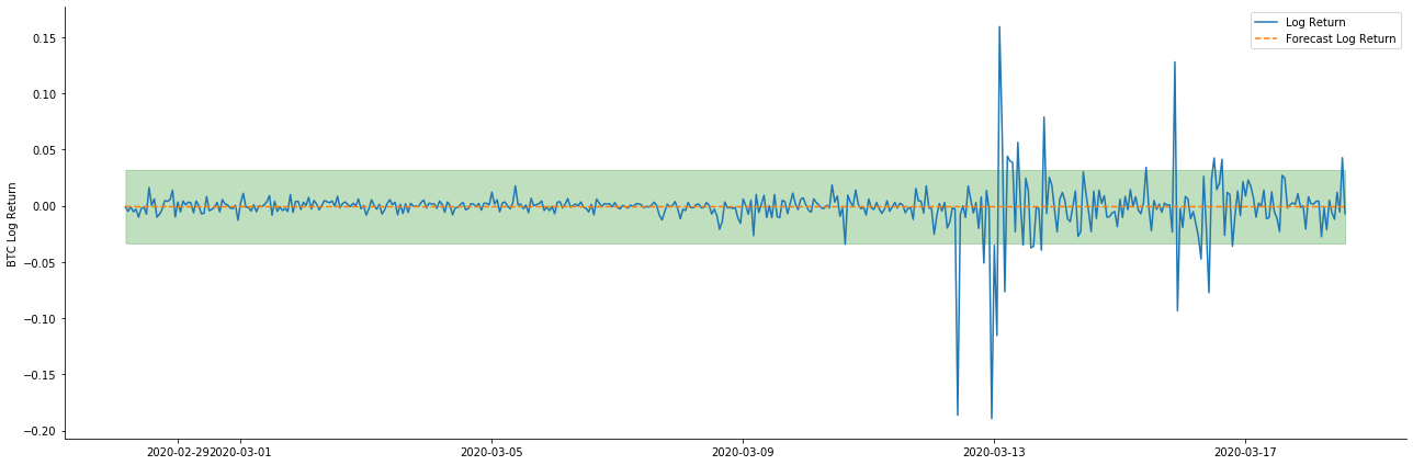
In [41]:
# Out-of-sample predicted data predict()
start_date = '2020-03-01 12:00:00+08:00'
end_date = '2020-03-20 23:00:00+08:00'
model = False

predict_step = 50
predicts_ARIMA_normal = model_results.get_prediction(start=start_date, dynamic=model, full_reports=True)
ci_normal = predicts_ARIMA_normal.conf_int().loc[start_date:]

predicts_ARIMA_normal_out = model_results.get_forecast(steps=predict_step, dynamic=model)
ci_normal_out = predicts_ARIMA_normal_out.conf_int().loc[start_date:end_date]

fig, ax = plt.subplots(figsize=(18,8))
kline_test.loc[start_date:end_date, 'log_return'].plot(ax=ax, label='Benchmark Log Return')

predicts_ARIMA_normal.predicted_mean.plot(ax=ax, style='g', label='In Sample Forecast')
ax.fill_between(ci_normal.index, ci_normal.iloc[:,0], ci_normal.iloc[:,1], color='g', alpha=0.1)

predicts_ARIMA_normal_out.predicted_mean.loc[:end_date].plot(ax=ax, style='r--', label='Out of Sample Forecast')
ax.fill_between(ci_normal_out.index, ci_normal_out.iloc[:,0], ci_normal_out.iloc[:,1], color='r', alpha=0.1)

plt.tight_layout()
plt.legend(loc='best')
sns.despine()
Out[41]:
Because the matching of data in the sample is a rolling forward prediction, when the amount of information in the sample is sufficient, the static model is prone to over matching, while the dynamic model lacks reliable dependent variables, and the effect becomes worse and worse after iteration. When forecasting the data outside the sample, the model is equivalent to the dynamic model within the sample, so the accuracy of the error term of long-term prediction is bound to be low.
If we reverse the return rate forecast to log_price (logarithmic price), the match is shown in the figure below:
In [42]:
params = (0, 1, 1)
mod = smt.SARIMAX(endog=kline_all['log_price'], trend='c', order=params, seasonal_order=(0, 0, 0, 0))
res = mod.fit(disp=False)

start_date = '2020-03-01 12:00:00+08:00'
end_date = '2020-03-15 23:00:00+08:00'

predicts_ARIMA_normal = res.get_prediction(start=start_date, dynamic=False, full_results=False)
predicts_ARIMA_dynamic = res.get_prediction(start=start_date, dynamic=True, full_results=False)

fig, ax = plt.subplots(figsize=(18,6))
kline_test.loc[start_date:end_date, 'log_price'].plot(ax=ax, label='Log Price')

predicts_ARIMA_normal.predicted_mean.loc[start_date:end_date].plot(ax=ax, style='r--', label='Normal Prediction')
ci_normal = predicts_ARIMA_normal.conf_int().loc[start_date:end_date]
ax.fill_between(ci_normal.index, ci_normal.iloc[:,0], ci_normal.iloc[:,1], color='r', alpha=0.1)

predicts_ARIMA_dynamic.predicted_mean.loc[start_date:end_date].plot(ax=ax, style='g', label='Dynamic Prediction')
ci_dynamic = predicts_ARIMA_dynamic.conf_int().loc[start_date:end_date]
ax.fill_between(ci_dynamic.index, ci_dynamic.iloc[:,0], ci_dynamic.iloc[:,1], color='g', alpha=0.1)

plt.tight_layout()
plt.legend(loc='best')
sns.despine()
Out[42]:
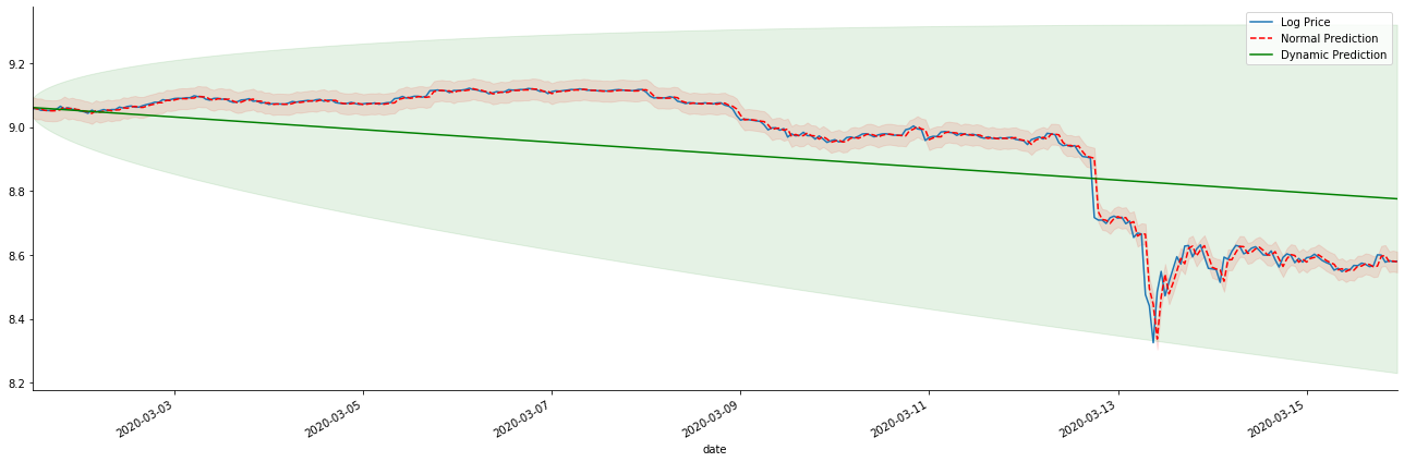
It is easy to see the matching advantages of the static model and the extreme difference between the dynamic model and the static model in long-term prediction. The red dotted line and the pink range… You can't say that the prediction of this model is wrong. After all, it covers the trend of the moving average completely, but… is it meaningful?
In fact, the ARMA model itself is not wrong, because the problem is not the model itself, but the objective logic of things themselves. The time series model can only be established based on the correlation between previous and subsequent observations. Therefore, it is impossible to model the white noise series. Therefore, all the previous work is based on a bold assumption that the return rate series of BTC cannot be independent and identically distributed.
In general, the return rate series are martingale difference series, which means that the return rate is unpredictable, and the weak efficiency assumption of the corresponding market holds. We have assumed that the return rates in individual samples have a certain degree of autocorrelation, and the same distribution assumption is also to make the matching model applicable to the training set, so that a simple ARMA model can be matched, which is bound to have a poor predictive effect.
However, the matched residual sequence is also a martingale difference sequence. The martingale difference sequence may not be independent and identically distributed, but the conditional variance may depend on the past value, so the first-order autocorrelation is gone, but there is still higher-order autocorrelation, which is also an important prerequisite for volatility to be modeled and observed.
If such a logic holds, then the premise of building various volatility models also holds. So for a return rate series, if a weakly efficient market is satisfied, then the mean value must be hard to predict, but the variance is predictable. And the matched ARMA provides a fair quality time series benchmark, then the quality also determines the quality of volatility prediction.
Finally, let's evaluate the effect of the prediction simply. With error as the evaluation benchmark, the indicators inside and outside the sample are as follows:
In [15]:
start = '2020-02-14 00:00:00+08:00'
predicts_ARIMA_normal = model_results.get_prediction(dynamic=False)
predicts_ARIMA_dynamic = model_results.get_prediction(dynamic=True)
training_label = 'log_return'

compare_ARCH_X = pd.DataFrame()
compare_ARCH_X['Model'] = ['NORMAL','DYNAMIC']
compare_ARCH_X['RMSE'] = [rmse(predicts_ARIMA_normal.predicted_mean[1:], kline_test[training_label][:826]),
                          rmse(predicts_ARIMA_dynamic.predicted_mean[1:], kline_test[training_label][:826])]
compare_ARCH_X['MAPE'] = [mape(predicts_ARIMA_normal.predicted_mean[:50], kline_test[training_label][:50]),
                          mape(predicts_ARIMA_dynamic.predicted_mean[:50], kline_test[training_label][:50])]
compare_ARCH_X
Out[15]:
Root Mean Square Error (RMSE): 0.0184
Root Mean Square Error (RMSE): 0.0167
Mean Absolute Percentage Error (MAPE): 2.25e+03
Mean Absolute Percentage Error (MAPE): 395
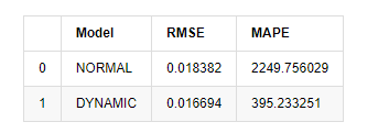
It can be seen that the static model is slightly better than the dynamic model in terms of the error coincidence between the predicted value and the real value. It matchs the logarithmic return rate of Bitcoin well, which is basically in line with expectations. Dynamic prediction lacks more accurate variable information, and the error is also magnified by iteration, so the prediction effect is poor. MAPE is greater than 100%, so the actual matchting quality of both models is not ideal.
In [18]:
predict_step = 50
predicts_ARIMA_normal_out = model_results.get_forecast(steps=predict_step, dynamic=False)
predicts_ARIMA_dynamic_out = model_results.get_forecast(steps=predict_step, dynamic=True)
testing_ts = kline_test
training_label = 'log_return'

compare_ARCH_X = pd.DataFrame()
compare_ARCH_X['Model'] = ['NORMAL','DYNAMIC']
compare_ARCH_X['RMSE'] = [get_rmse(predicts_ARIMA_normal_out.predicted_mean, testing_ts[training_label]),
                          get_rmse(predicts_ARIMA_dynamic_out.predicted_mean, testing_ts[training_label])]
compare_ARCH_X['MAPE'] = [get_mape(predicts_ARIMA_normal_out.predicted_mean, testing_ts[training_label]),
                          get_mape(predicts_ARIMA_dynamic_out.predicted_mean, testing_ts[training_label])]
compare_ARCH_X
Out[18]:
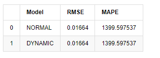
Since the next prediction outside the sample depends on the results of the previous step, only the dynamic model is effective. However, the long-term error defect of the dynamic model leads to the insufficient prediction ability of the overall model, so the next step is predicted at most.
To sum up, the ARMA model static model is suitable for matching the intra sample rate of return of Bitcoin. The short-term prediction of the rate of return can cover the confidence interval effectively, but the long-term prediction is very difficult, which meets the weak effectiveness of the market. After testing, the return rate within the sample interval meets the premise of subsequent volatility observation.
5. ARCH effect
ARCH model effect is the series correlation of conditional heteroscedasticity sequence. The mixture test Ljung Box is used to test the correlation of the residual square series to determine whether there is ARCH effect. If the ARCH effect test is passed, that is, the series has heteroscedasticity, the next step of GARCH modeling can be carried out to estimate the mean equation and volatility equation jointly. Otherwise, the model needs to be optimized and readjusted, such as differential processing or reciprocal series.
We prepare some data sets and global variables here:
In [33]:
count_num = 100000
start_date = '2020-03-01'

df = get_bars('huobi.btc_usdt', '1m', count=count_num, start=start_date)  # Take the minute data
kline_1m = pd.DataFrame(df['close'], dtype=np.float)
kline_1m.index.name = 'date'
kline_1m['log_price'] = np.log(kline_1m['close'])
kline_1m['return'] = kline_1m['close'].pct_change().dropna()
kline_1m['log_return'] = kline_1m['log_price'] - kline_1m['log_price'].shift(1)

kline_1m['squared_log_return'] = np.power(kline_1m['log_return'], 2)

kline_1m['return_100x'] = np.multiply(kline_1m['return'], 100)
kline_1m['log_return_100x'] = np.multiply(kline_1m['log_return'], 100)  # Enlarge 100 times

df = get_bars('huobi.btc_usdt', '1h', count=count_num, start=start_date)  # Take the hour data
kline_test = pd.DataFrame(df['close'], dtype=np.float)
kline_test.index.name = 'date'
kline_test['log_price'] = np.log(kline_test['close'])  # Calculate the daily logarithmic rate of return
kline_test['return'] = kline_test['log_price'].pct_change().dropna()
kline_test['log_return'] = kline_test['log_price'] - kline_test['log_price'].shift(1)  # Calculate the logarithmic rate of return
kline_test['squared_log_return'] = np.power(kline_test['log_return'], 2)  # Exponential square of log daily return rate

kline_test['return_100x'] = np.multiply(kline_test['return'], 100)
kline_test['log_return_100x'] = np.multiply(kline_test['log_return'], 100)  # Enlarge 100 times

kline_test['realized_variance_1_hour'] = kline_1m.loc[:, 'squared_log_return'].resample('h', closed='left', label='left').sum().copy() # Resampling to days
kline_test['realized_volatility_1_hour'] = np.sqrt(kline_test['realized_variance_1_hour'])  # Volatility of variance derivation

kline_test = kline_test[4:-2500]
kline_test.head(3)
Out[33]:
In [22]:
cc = 3
model_p = 1
predict_lag = 30
label = 'log_return'

training_label = label
training_ts = pd.DataFrame(kline_test[training_label], dtype=np.float)

training_arch_label = label
training_arch = pd.DataFrame(kline_test[training_arch_label], dtype=np.float)

training_garch_label = label
training_garch = pd.DataFrame(kline_test[training_garch_label], dtype=np.float)

training_egarch_label = label
training_egarch = pd.DataFrame(kline_test[training_egarch_label], dtype=np.float)

training_arch.plot(figsize = (18,4))
Out[22]:
Logarithmic return rates are shown above. Next, we need to test the ARCH effect of the sample. We establish the residual series within the sample based on ARMA. Some series and the square series of residual and residual are calculated first:
In [20]:
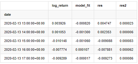
training_arma_model = smt.SARIMAX(endog=training_ts, trend='c', order=(0, 0, 1), seasonal_order=(0, 0, 0, 0))
arma_model_results = training_arma_model.fit(disp=False)
arma_model_results.summary()
training_arma_fitvalue = pd.DataFrame(arma_model_results.fittedvalues,dtype=np.float)
at = pd.merge(training_ts, training_arma_fitvalue, on='date')
at.columns = ['log_return', 'model_fit']
at['res'] = at['log_return'] - at['model_fit']
at['res2'] = np.square(at['res'])
at.head()
Out[20]:
The residual series of the sample is then plotted
In [69]:
fig, ax = plt.subplots(figsize=(18, 6))
ax1 = fig.add_subplot(2,1,1)
at['res'][1:].plot(ax=ax1,label='resid')
plt.legend(loc='best')

ax2 = fig.add_subplot(2,1,2)
at['res2'][1:].plot(ax=ax2,label='resid2')

plt.legend(loc='best')
plt.tight_layout()
sns.despine()
Out[69]:
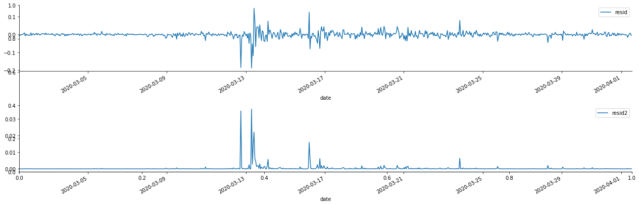
It can be seen that the residual series has obvious aggregation characteristics, and it can be judged initially that the series has ARCH effect. ACF is also taken to test the autocorrelation of the squared residuals, and the results are as follows.
In [70]:
figure = plt.figure(figsize=(18,4))
ax1 = figure.add_subplot(111)
fig = sm.graphics.tsa.plot_acf(at['res2'],lags = 40, ax=ax1)
Out[70]:
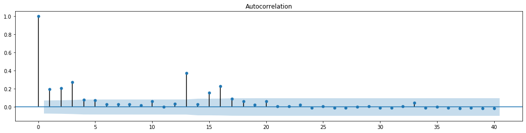
The original assumption for the series blending test is that the series has no correlation. It can be seen that the corresponding P values of the first 20 orders of data are less than the critical value of the 0.05% confidence level. Therefore, the original assumption is rejected, that is, the residual of the series has the ARCH effect. The variance model can be established through the ARCH type model to fit the heteroscedasticity of the residual series and further predict the volatility.
6. GARCH modeling
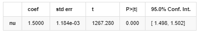
Before performing GARCH modeling, we need to deal with the fat tail part of the series. Because the error term of the series in the hypothesis needs to conform to the normal distribution or t distribution, and we have previously verified that the yield series has a fat tail distribution, so we need to describe and supplement this part.
In GARCH modeling, the error item provides the options of normal distribution, t-distribution, GED (Generalized Error Distribution) distribution and Skewed Students t-distribution. According to AIC criteria, we use enumeration joint regression estimation to compare the results of all options, and get the best matchting degree of GED, and the process was omitted.
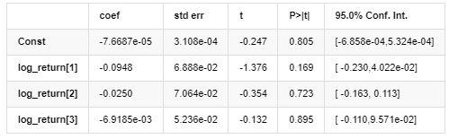
The matching degree of Normal normal distribution is not as good as t distribution, which also shows that the yield distribution has a thicker tail than the normal distribution. Next, enter the modeling process, an ARMA-GARCH(1,1) model regression is executed for log_return (logarithmic rate of return) and estimated as follows:
In [23]:
am_GARCH = arch_model(training_garch, mean='AR', vol='GARCH',
                      p=1, q=1, lags=3, dist='ged')
res_GARCH = am_GARCH.fit(disp=False, options={'ftol': 1e-01})
res_GARCH.summary()
Out[23]:
Iteration: 1, Func. Count: 10, Neg. LLF: -1917.4262154917305
AR - GARCH Model Results
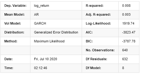
Mean Model
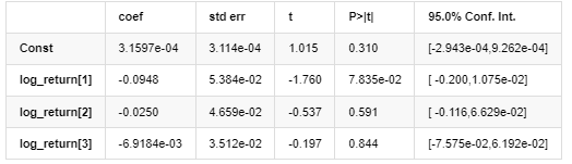
Volatility Model
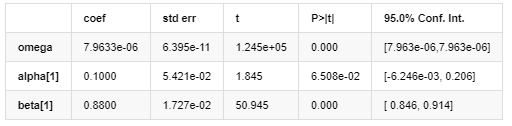
Distribution
Covariance estimator: robust
Description of GARCH volatility equation according to ARCH database:
The conditional regression equation for volatility can be obtained as:
Combined with the matched predicted volatility, compare it with the realized volatility of the sample to see the effect.
In [26]:
def recursive_forecast(pd_dataframe):
window = predict_lag
model = 'GARCH'
index = kline_test[1:].index
end_loc = np.where(index >= kline_test.index[window])[0].min()
forecasts = {}
for i in range(len(kline_test[1:]) - window + 2):
mod = arch_model(pd_dataframe['log_return'][1:], mean='AR', vol=model, dist='ged',p=1, q=1)
res = mod.fit(last_obs=i+end_loc, disp='off', options={'ftol': 1e03})
temp = res.forecast().variance
fcast = temp.iloc[i + end_loc - 1]
forecasts[fcast.name] = fcast
forecasts = pd.DataFrame(forecasts).T
pd_dataframe['recursive_{}'.format(model)] = forecasts['h.1']
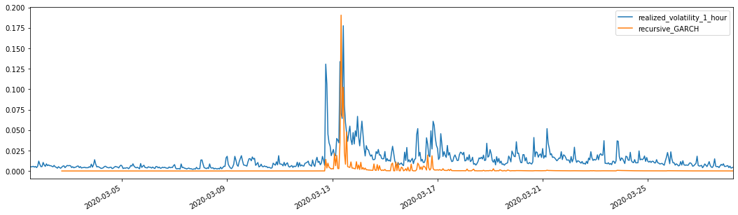
evaluate(pd_dataframe, 'realized_volatility_1_hour', 'recursive_{}'.format(model))
recursive_forecast(kline_test)
Out[26]:
Mean Absolute Error (MAE): 0.0128
Mean Absolute Percentage Error (MAPE): 95.6
Root Mean Square Error (RMSE): 0.018
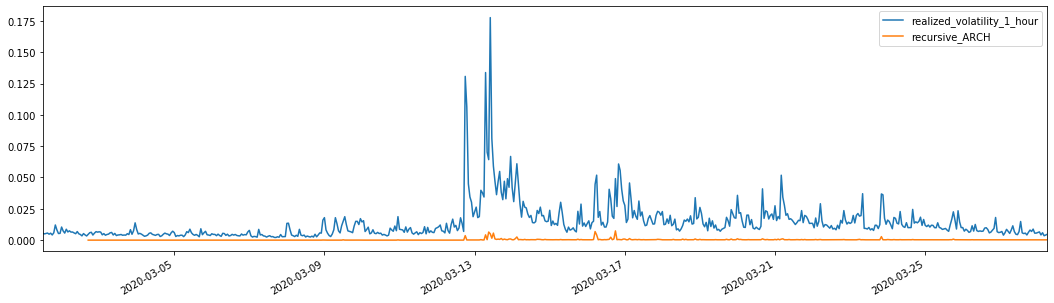
For comparison, make an ARCH as follows:
In [27]:
def recursive_forecast(pd_dataframe):
    window = predict_lag
    model = 'ARCH'
    index = kline_test[1:].index
    end_loc = np.where(index >= kline_test.index[window])[0].min()
    forecasts = {}
    for i in range(len(kline_test[1:]) - window + 2):
        mod = arch_model(pd_dataframe['log_return'][1:], mean='AR', vol=model, dist='ged', p=1)
        res = mod.fit(last_obs=i+end_loc, disp='off', options={'ftol': 1e03})
        temp = res.forecast().variance
        fcast = temp.iloc[i + end_loc - 1]
        forecasts[fcast.name] = fcast

    forecasts = pd.DataFrame(forecasts).T
    pd_dataframe['recursive_{}'.format(model)] = forecasts['h.1']
    evaluate(pd_dataframe, 'realized_volatility_1_hour', 'recursive_{}'.format(model))

recursive_forecast(kline_test)
Out[27]:
Mean Absolute Error (MAE): 0.0136
Mean Absolute Percentage Error (MAPE): 98.1
Root Mean Square Error (RMSE): 0.02
7. EGARCH modeling
The next step is to perform EGARCH modeling
In [24]:
am_EGARCH = arch_model(training_egarch, mean='AR', vol='EGARCH',
                       p=1, lags=3, o=1,q=1, dist='ged')
res_EGARCH = am_EGARCH.fit(disp=False, options={'ftol': 1e-01})
res_EGARCH.summary()
Out[24]:
Iteration: 1, Func. Count: 11, Neg. LLF: -1966.610328148909
AR - EGARCH Model Results
Mean Model
Volatility Model
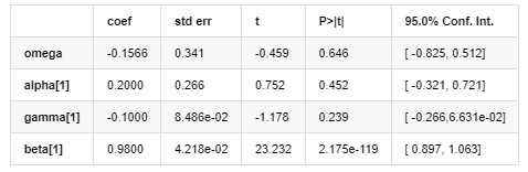
Distribution
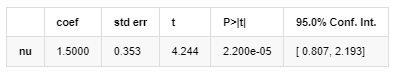
Covariance estimator: robust
The EGARCH volatility equation provided by ARCH library is described as follows:
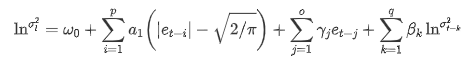
substitute
The conditional regression equation of volatility can be obtained as follows:

Among them, the estimated coefficient of symmetric term γ is less than the confidence interval, indicating that there is a significant "asymmetry" in the volatility of Bitcoin return rates.
Combined with the matched predicted volatility, the results are compared with the realized volatility of the sample as follows:
In [28]:
def recursive_forecast(pd_dataframe):
    window = 280
    model = 'EGARCH'
    index = kline_test[1:].index
    end_loc = np.where(index >= kline_test.index[window])[0].min()
    forecasts = {}
    for i in range(len(kline_test[1:]) - window + 2):
        mod = arch_model(pd_dataframe['log_return'][1:], mean='AR', vol=model,
                         lags=3, p=2, o=0, q=1, dist='ged')
        res = mod.fit(last_obs=i+end_loc, disp='off', options={'ftol': 1e03})
        temp = res.forecast().variance
        fcast = temp.iloc[i + end_loc - 1]
        forecasts[fcast.name] = fcast

    forecasts = pd.DataFrame(forecasts).T
    pd_dataframe['recursive_{}'.format(model)] = forecasts['h.1']
    evaluate(pd_dataframe, 'realized_volatility_1_hour', 'recursive_{}'.format(model))
    pd_dataframe['recursive_{}'.format(model)]

recursive_forecast(kline_test)
Out[28]:
Mean Absolute Error (MAE): 0.0201
Mean Absolute Percentage Error (MAPE): 122
Root Mean Square Error (RMSE): 0.0279
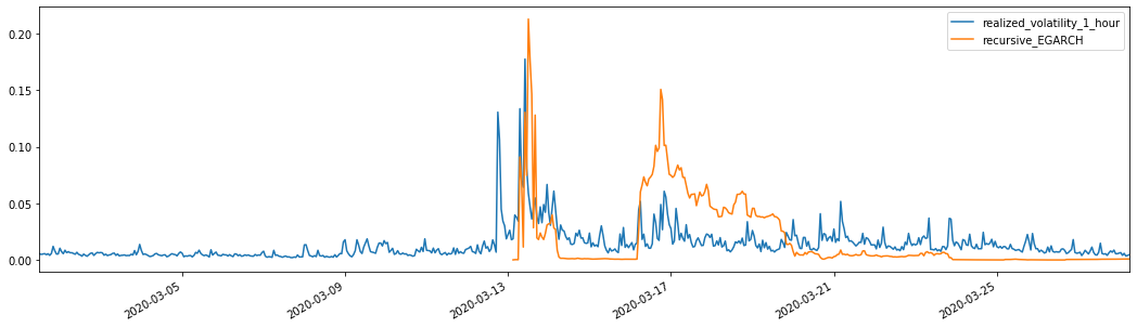
It can be seen that EGARCH is more sensitive to volatility and better matchs volatility than ARCH and GARCH.
8. Evaluation of volatility prediction
The hourly data is selected based on the sample, and the next step is to predict one hour ahead. We select the predicted volatility of the first 10 hours of the three models, with RV as the benchmark volatility. The comparative error value is as follows:
In [29]:
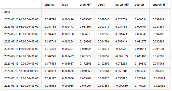
compare_ARCH_X = pd.DataFrame()
compare_ARCH_X['original']=kline_test['realized_volatility_1_hour']

compare_ARCH_X['arch']=kline_test['recursive_ARCH']
compare_ARCH_X['arch_diff']=compare_ARCH_X['original']-np.abs(compare_ARCH_X['arch'])

compare_ARCH_X['garch']=kline_test['recursive_GARCH']
compare_ARCH_X['garch_diff']=compare_ARCH_X['original']-np.abs(compare_ARCH_X['garch'])

compare_ARCH_X['egarch']=kline_test['recursive_EGARCH']
compare_ARCH_X['egarch_diff']=compare_ARCH_X['original']-np.abs(compare_ARCH_X['egarch'])
compare_ARCH_X = compare_ARCH_X[280:]
compare_ARCH_X.head(10)
Out[29]:
In [30]:
compare_ARCH_X_diff = pd.DataFrame(index=['ARCH','GARCH','EGARCH'], columns=['head 1 step', 'head 10 steps', 'head 100 steps'])
compare_ARCH_X_diff['head 1 step']['ARCH'] = compare_ARCH_X['arch_diff']['2020-03-13 04:00:00+08:00']
compare_ARCH_X_diff['head 10 steps']['ARCH'] = np.mean(compare_ARCH_X['arch_diff'][:10])
compare_ARCH_X_diff['head 100 steps']['ARCH'] = np.mean(compare_ARCH_X['arch_diff'][:100])
compare_ARCH_X_diff['head 1 step']['GARCH'] = compare_ARCH_X['garch_diff']['2020-03-13 04:00:00+08:00']
compare_ARCH_X_diff['head 10 steps']['GARCH'] = np.mean(compare_ARCH_X['garch_diff'][:10])
compare_ARCH_X_diff['head 100 steps']['GARCH'] = np.mean(compare_ARCH_X['garch_diff'][:100])
compare_ARCH_X_diff['head 1 step']['EGARCH'] = compare_ARCH_X['egarch_diff']['2020-03-13 04:00:00+08:00']
compare_ARCH_X_diff['head 10 steps']['EGARCH'] = np.mean(compare_ARCH_X['egarch_diff'][:10])
compare_ARCH_X_diff['head 100 steps']['EGARCH'] = np.abs(np.mean(compare_ARCH_X['egarch_diff'][:100]))
compare_ARCH_X_diff
Out[30]:
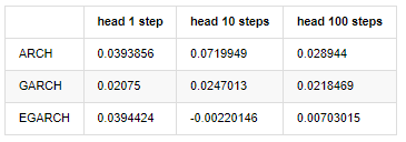
Several tests have been conducted, in the prediction results of the first hour, the probability of the smallest error of EGARCH is relatively large, but the overall difference is not particularly obvious; There are some obvious differences in short-term prediction effects; EGARCH has the most outstanding prediction ability in the long-term prediction
In [31]:
compare_ARCH_X = pd.DataFrame()
compare_ARCH_X['Model'] = ['ARCH','GARCH','EGARCH']
compare_ARCH_X['RMSE'] = [get_rmse(kline_test['realized_volatility_1_hour'][280:320],kline_test['recursive_ARCH'][280:320]),
                          get_rmse(kline_test['realized_volatility_1_hour'][280:320],kline_test['recursive_GARCH'][280:320]),
                          get_rmse(kline_test['realized_volatility_1_hour'][280:320],kline_test['recursive_EGARCH'][280:320])]
compare_ARCH_X['MAPE'] = [get_mape(kline_test['realized_volatility_1_hour'][280:320],kline_test['recursive_ARCH'][280:320]),
                          get_mape(kline_test['realized_volatility_1_hour'][280:320],kline_test['recursive_GARCH'][280:320]),
                          get_mape(kline_test['realized_volatility_1_hour'][280:320],kline_test['recursive_EGARCH'][280:320])]
compare_ARCH_X['MASE'] = [get_mape(kline_test['realized_volatility_1_hour'][280:320],kline_test['recursive_ARCH'][280:320]),
                          get_mape(kline_test['realized_volatility_1_hour'][280:320],kline_test['recursive_GARCH'][280:320]),
                          get_mape(kline_test['realized_volatility_1_hour'][280:320],kline_test['recursive_EGARCH'][280:320])]

compare_ARCH_X
Out[31]:
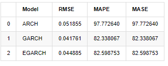
In terms of indicators, GARCH and EGARCH have some improvement compared with ARCH, but the difference is not particularly obvious. After multi sample interval selection and verification, EGARCH will have better performance, which is mainly because EGARCH explains the heteroscedasticity of samples well.
9. Conclusion
From the above simple analysis, it can be found that the logarithmic return rate of Bitcoin does not conform to the normal distribution, which is characterized by thick fat tails, and the volatility has aggregation and leverage effect, while showing obvious conditional heterogeneity.
In the prediction and evaluation of logarithmic rate of return, the ARMA model's intra sample static prediction ability is better than the dynamic one significantly, which shows that the rolling method is obviously better than the iterative method, and can avoid the problems of overmatching and error amplification. The rate of return outside the sample is difficult to predict, which satisfies the weak efficiency assumption of the market.
In addition, when dealing with the thick tail phenomenon of Bitcoin, that is, the thick tail distribution of returns, it is found that the GED (generalized error) distribution is better than the t distribution and normal distribution significantly, which can improve the measurement accuracy of tail risk. At the same time, EGARCH has more advantages in predicting long-term volatility, which well explains the heteroscedasticity of the sample. The symmetric estimation coefficient in the model matching is less than the confidence interval, which indicates that there is a significant "asymmetry" in the return rates fluctuation of Bitcoin.
The whole modeling process is full of various bold assumptions, and there is no consistency identification depending on validity, so we can only verify some phenomena carefully. History can only support the probability of predicting the future in statistics, but the accuracy and cost performance ratio still have a long hard journey to go.
Compared with traditional markets, the availability of high-frequency data of Bitcoin is easier. The "realized" measurement of various indicators based on high-frequency data becomes simple and important. If nonparametric measures can provide quick observation for the market that has occurred, and measures with parameters can improve the input accuracy of the model, then taking the realized nonparametric measures as the "Hyperparameters" of the model may establish a more "complete" model.
However, the above is limited to theory. Higher frequency data can indeed provide more accurate analysis of traders' behavior. It can not only provide more reliable tests for financial theoretical models, but also provide more abundant decision-making information for traders, even support the prediction of information flow and capital flow, and assist in designing more precise quantitative trading strategies. However, the Bitcoin market is so volatile that too long historical data can not match effective decision-making information, so high-frequency data will certainly bring greater market advantages to investors of digital currency.
Finally, if you think the above content helpful, you can also offer a little BTC to buy me a cup of Cola. But I don't need coffee, I will fall asleep after drinking it····