article originally from : https://www.quandl.com/
MACD is a popularly used technical indicator in trading stocks, currencies, cryptocurrencies, etc.

Basics of MACD
MACD is used and discussed in many different trading circles. Moving Average Convergence Divergence (MACD) is a trend following indicator. MACD can be calculated very simply by subtracting the 26 period EMA from the 12 period EMA. We previously discussed EMAs in our article here. MACD can be used and interpreted in a handful of different ways to give the trader potential value and insight into their trading decisions.
Useful Strategies
MACD is commonly used by analyzing crossovers, divergences, and periods of steep slope (positive or negative). Along with the MACD line (from subtracting the 12 period EMA from the 16 period EMA) the chart commonly will include a signal line plotted on top of the MACD. This signal line is a 9 day EMA of the MACD.
In a bullish crossover, just like in Moving Averages, a buy signal occurs when MACD crosses above the signal line. A bearish signal occurs when MACD crosses below the signal line. If a crossover occurs with a high sloping MACD, this can be a sign of an overbought or oversold condition, depending on if the crossover is bullish or bearish respectively. MACD is a great indicator for understanding if movement in the price is strong or weak. A weak movement is likely to correct and a strong movement is likely to continue.
Divergences are also simple to understand. When the MACD establishes a high or low diverging from highs or lows in the price it establishes a divergence. A bullish divergence is in place when MACD has two rising lows on the MACD with two falling lows on the asset price. Divergences can be used to find a changing trend. Traders are always looking for the competitive edge and predicting a trend change can be very profitable. Of course, divergences are not completely reliable and should only be used as an additional piece of information, not a sole indication of price direction.
Steep slope can signal an overbought or oversold situation. In such a situation a stock’s trend is likely soon to lose steam and see a correction or reversal from current direction.
Python Implementation
We start as we always do by picking a stock and gathering the data. As usual, we’ll do our analysis on AMD and use the IEX API to grab the data. IEX has always been a highly reliable source of data for me, but you can use Quandl or whatever other source of data you prefer.
import pandas as pd
import numpy as np
from datetime import datetime
import matplotlib.pyplot as plt
import pyEX as p
ticker = 'AMD'
timeframe = '6m'
df = p.chartDF(ticker, timeframe)
df = df[['close']]
df.reset_index(level=0, inplace=True)
df.columns=['ds','y']
plt.plot(df.ds, df.y, label='AMD')
plt.show()
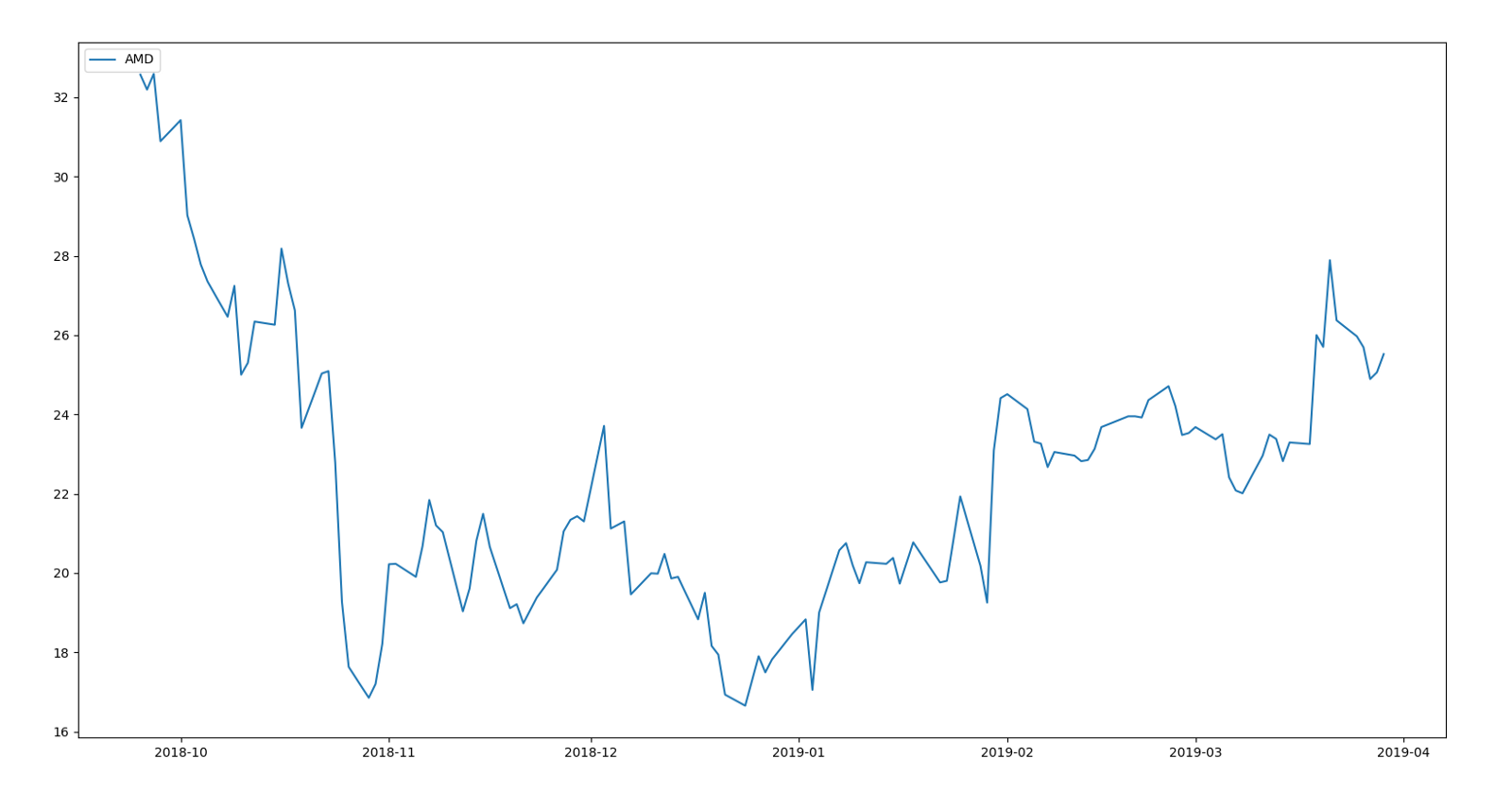
AMD from late 2018 to present date (early 2019).
exp1 = df.y.ewm(span=12, adjust=False).mean()
exp2 = df.y.ewm(span=26, adjust=False).mean()
macd = exp1-exp2
exp3 = macd.ewm(span=9, adjust=False).mean()
plt.plot(df.ds, macd, label='AMD MACD', color = '#EBD2BE')
plt.plot(df.ds, exp3, label='Signal Line', color='#E5A4CB')
plt.legend(loc='upper left')
plt.show()
This allows us to plot the MACD vs the signal line. See if you can spot the bullish and bearish crossovers!
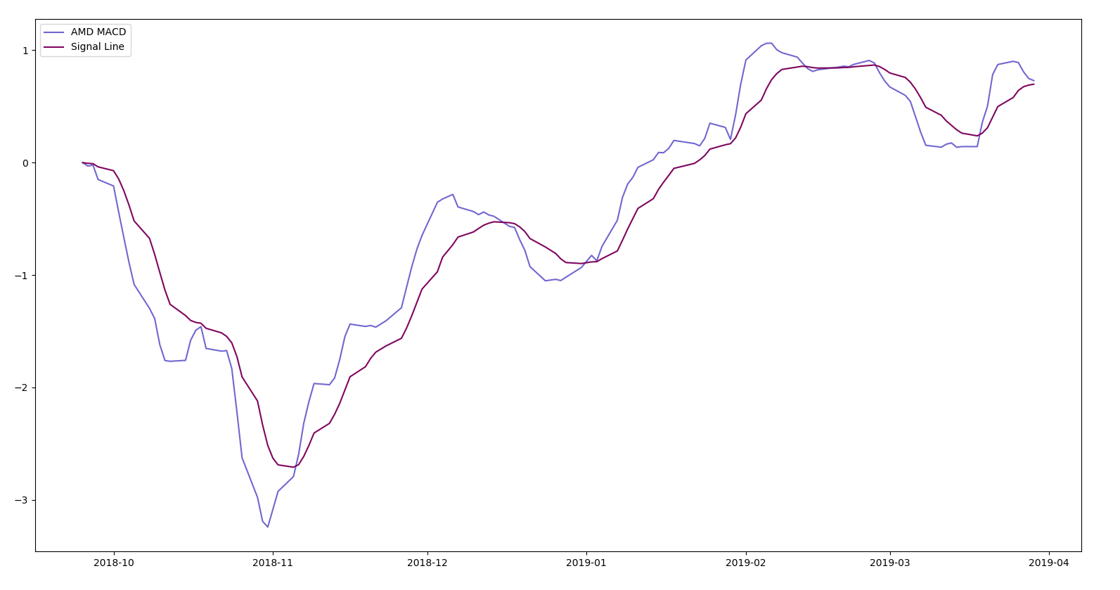
MACD vs Signal Line
Check the graph below. Were you correct? Remember, a bullish crossover happens when the MACD crosses above the signal line and a bearish crossover happens when the MACD crosses below the signal line.
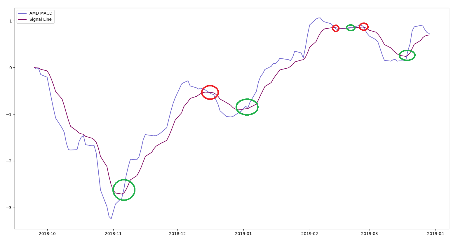
Bullish crossover represented in green, bearish crossover represented in red.
The above example was a simple way to use MACD to study crossovers. Next, let’s study strength and examine overbought or oversold conditions.
We start by implementing the exponential moving averages and MACD.
exp1 = df.y.ewm(span=12, adjust=False).mean()
exp2 = df.y.ewm(span=26, adjust=False).mean()
exp3 = df.y.ewm(span=9, adjust=False).mean()
macd = exp1-exp2
plt.plot(df.ds, df.y, label='AMD')
plt.plot(df.ds, macd, label='AMD MACD', color='orange')
plt.plot(df.ds, exp3, label='Signal Line', color='Magenta')
plt.legend(loc='upper left')
plt.show()
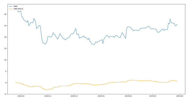
Blue line represents the AMD stock price, orange line represents the MACD
We can blow this MACD line up a bit by plotting it separate from the stock price and see the steep slopes more clearly.
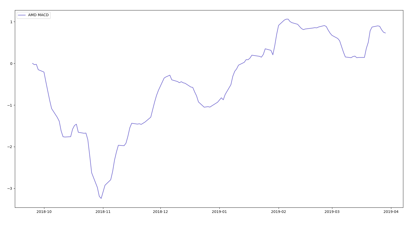
MACD from late 2018 to present date (early 2019).
Let’s recall our discussion of overbought and oversold from earlier. We can see the MACD stays pretty flat over time. But there are certain times where the MACD curve is steeper than others. These are instances of overbought or oversold conditions. We represent our oversold conditions with green circles and overbought with red circles. You can see that soon after the MACD shows an overbought or oversold condition the momentum slowed and the stock price reacted accordingly.
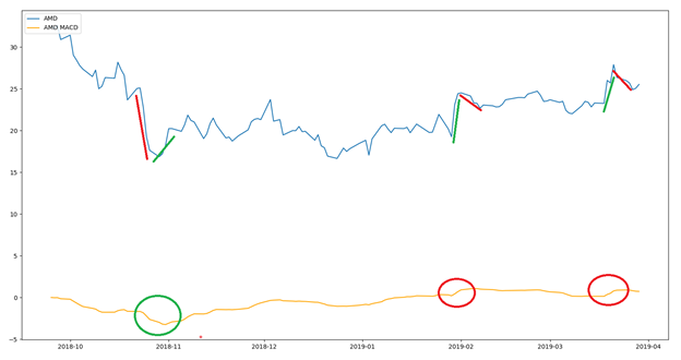
Green circles correspond to bullish divergence, red corresponds to bearish divergence
We briefly discussed MACD and implemented it in Python to examine its use in crossovers and overbought/oversold conditions. Hopefully this article helped you add another tool to your trading toolbox!